
(our values)
Human experience
Every system we draw is tested against a person, not a screen. If it does not read in one glance, it goes back.
Design with purpose
We start from what the brand must do, never from what would look new. Decoration that carries no meaning is removed.
Lasting impact
A mark should outlive the campaign it launched with. We build identities that age in decades, not quarters.
Most brands are not underdesigned.
They are overbuilt — a mark, a second mark for small sizes, four typefaces, a mascot, a pattern, and a tone of voice nobody can repeat.
 Before
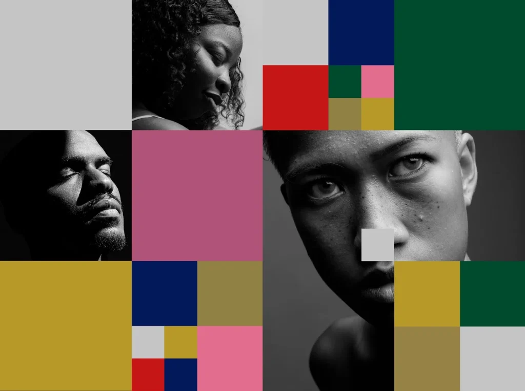 After
After
We take all of it away and give back the one system a company can actually run without us in the room.
Who you will be working with.
All four are in every project. We do not photograph ourselves — you will meet us on the call.
(direction)
Ines Marchetti
Founded the studio after eleven years in packaging. Runs the position paper and every client conversation that involves a number.
(type and marks)
Tomas Ek
Draws the letters. Has redrawn a licensed typeface for four of the last six identities because the original was almost right.
(digital)
Nadia Rehn
Builds what the system has to survive: the site, the product surfaces, and the component library the client's own team will edit.
(words)
Casper Lund
Writes the voice and then writes the first hundred sentences in it, so nobody has to guess what the guideline meant.
(fourteen years)
(2012)
Two desks on Gothersgade
Ines and Tomas take the lease on a first-floor room above a bookbinder and keep it.
(2016)
The two-a-season rule
After a year of six overlapping projects the studio caps itself at two, and turns down more work than it takes from then on.
(2019)
Nadia and the build
Digital stops being outsourced. Every identity from Halvard onward ships with the site drawn in the same file as the mark.
(2024)
The colour goes
The studio's own identity is redrawn without a single hue, on the argument that a brand consultancy should be legible in its clients' colours and not its own.
See what it looks like finished.
Thirty-one identities, two a season, every one of them still in use.